
This document contains normative guidelines for web applications built by the Product Development department of Fellowship Technologies, as specified by the UX team. It is to be readily available to anyone who wishes to check the iterative progress of our best practices.
Design Patterns
The primary benefit of using design patterns is that we are not constantly re-inventing the wheel when coming up with the general functionality of a site or web application. Another benefit is that these design patters often mirror or mimic other similar functionality found throughout the rest of the Internet. This allows users to feel more comfortable and familiar with a web application, rather than having to learn a foreign system.
Design patterns can help applications be understood quicker. They can be thought of in terms of various automobiles. Though they differ, the steering wheel and pedals are readily familiar to any licensed driver.
Color Swatches

These are the colors that we use in various capacities throughout the Fellowship One interface, as well as the branding of our groups app entitled InFellowship. While the palette is not strictly limited to this particular range, we have found these hues to be a good fit. Their hex values are: #EEEEE0, #DDDDD0, #BBBBB0, #FF9900, #6699CC, #336699, #669933, #336600, #993333, #663333, #996633, #554433.
Dynamic Interfaces
Add Another

| Problem | The user needs to add another piece of data, akin to the information s/he is currently viewing. |
|---|---|
| Pattern | An add link is placed below the list of data. Delete links accompany each newly added item. |
| Result | This allows the user to add new data, without having to visit a new page for data entry. |
Confirmation
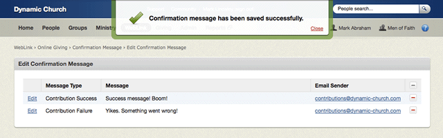
| Problem | The user needs to be informed when an action was accomplished successfully. |
|---|---|
| Pattern | A dynamic message overlay appears for a few seconds, then quietly animates out of sight. |
| Result | This gives brief feedback, without being obtrusive to the user as s/he continues to work. |
Error Feedback

| Problem | The user needs to be made aware of potential problems with a form submission. |
|---|---|
| Pattern | A message appears, prominently above page content, listing the errors that were found. |
| Result | This allows the user to read the errors, and dismiss with the hide link when finished. |
Drawer Navigation
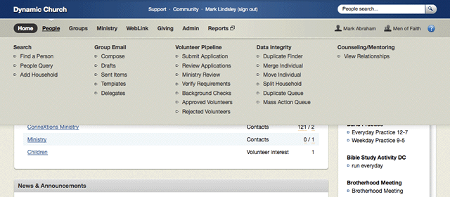
| Problem | The user needs to see, at a glance, a listing of hierarchical links in an application. |
|---|---|
| Pattern | A dynamic drawer menu slides down over the page content, revealing helpful links. |
| Result | This allows the user easier access to sections of the application, no matter where s/he is. |
Logout Counter
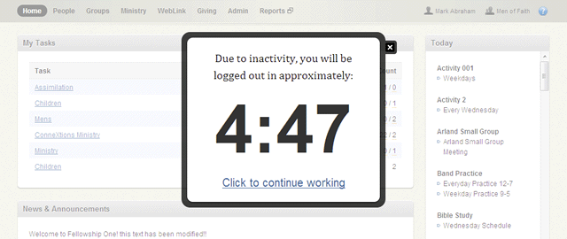
| Problem | In the interest of protecting personal data, an unattended session should be ended. |
|---|---|
| Pattern | If a user leaves the browser idle for a period of time, s/he is prompted with a countdown. |
| Result | Unless the user dismisses the modal within 5 minutes, the app redirects to the login page. |
Menus & Actions

Gear Menu
| Problem | The user needs actionable items one-click away, without cluttering the interface. |
|---|---|
| Pattern | A gear menu contains a list of collapsible actions, at the top-right of the interface. |
| Result | This allows quick access to a variety of actions, while still allowing the user to work. |
Actions
| Problem | The user needs to have actionable items visibly nearby, but not as the page's focal point. |
|---|---|
| Pattern | An actions sidebar is provided, which is supplementary to the page's primary purpose. |
| Result | The user can focus on the task at hand, but can also take secondary actions, if need be. |
Forms
Fieldset vs. Box

| Problem | Data needs to be grouped into logical sections, for easier visual scanning and reading. |
|---|---|
| Pattern |
Small portions go in a <fieldset>. Larger groupings should be in <div class="box">.
|
| Result | This helps visually distinguish the size of data sets and importance of form elements. |
Simple Form

| Problem | The user wants to enter a small amount of data, and needs an accommodating interface. |
|---|---|
| Pattern | When a form only requires limited information, labels and inputs belong on their own lines. |
| Result | This allows the user to quickly fill out the form, because it is easy to scan visually. |
| Code | View example |
Complex Form
| Problem | The user wants to enter a large amount of data, and needs an accommodating interface. |
|---|---|
| Pattern | Form labels and inputs are arranged side-by-side to allow more inputs per vertical space. |
| Result | This allows the user to enter more data, without having to scroll the page as much. |
| Code | View example |
Miscellaneous
Step Wizard
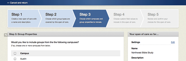
| Problem | The user needs to perform a sequence of tasks, without knowing how long it will take. |
|---|---|
| Pattern | A series of steps and accompanying descriptions appear above each part of the process. |
| Result | The user has a way to gauge his/her progress while working on each respective task. |
Persistent Message

| Problem | The user needs to be made aware of an important message, provided by the business. |
|---|---|
| Pattern | At the top of every page, a persistent system-wide notice is prominently displayed. |
| Result | The user is presented with an announcement, but can still use the app unhindered. |
Back Tab

| Problem | The user needs to return to a previous page, while maintaining the current state of the session. |
|---|---|
| Pattern | In the top-left of the page, there is a back tab that will take the user to the previous page. |
| Result | This allows the user to go back, without breaking the statefulness of the application. |
Composition

Rich Text Editor
| Problem | The user needs to compose an rich text message, such as an email or church announcement. |
|---|---|
| Pattern | A rich text editor offers a familiar interface, akin to what might be seen in a word processor. |
| Result | This allows the user to compose a message using an intuitive point-and-click workflow. |
Enhanced Actions
| Problem |
The user needs to insert variables such as {FirstName} and {LastName} into a message.
|
|---|---|
| Pattern | Using one-click actions on the side of a page, the user can easily supplement an email. |
| Result | This allows a user to write messages quickly, which can be sent to multiple recipients. |
Pill Tabs

| Problem | The user needs to access sub-content that has been obscured within the same page. |
|---|---|
| Pattern | Using stylized links that function as tabs, the user can hide or show relevant material. |
| Result | This allows the interface to remain uncluttered, while still facilitating heavier content. |
| Code | View example |
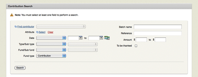
Advanced Search
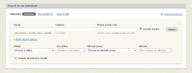
| Problem | The user needs to perform a search using a specific set of criteria, beyond a basic query. |
|---|---|
| Pattern | Using a toggle-able set of additional search fields, the user can enter more specific details. |
| Result | By providing additional search criteria, the user can narrow the result set considerably. |
| Code | View example |
Match Indicator

| Problem | When attempting to compare two or more data sets, the user needs to know if they match. |
|---|---|
| Pattern | A strength indicator depicts visually (on a scale of 1 to 5) how close of a match is found. |
| Result | This allows a user to easily see how closely related the results are to the search criteria. |
Personalized Data
Avatar or Photo
![]()
| Problem | An interface must account for multiple individual photos, without slowing the page load. |
|---|---|
| Pattern | Icons are present, that when hovered over, display either a generic avatar or user photo. |
| Result | Users can view profile images conveniently, and browser performance remains efficient. |
Involvement Graph
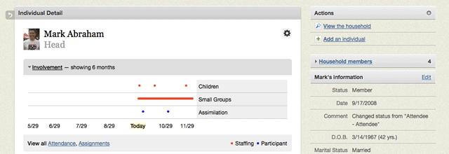
| Problem | The user needs to see how involved an individual has been in an area of ministry. |
|---|---|
| Pattern | Attendance and involvement in various programs can be plotted chronologically. |
| Result | This allows an administrator to gauge how active people are in their various roles. |
Modal Window
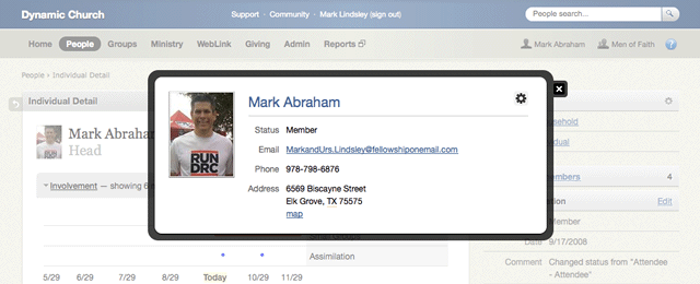
| Problem | The user needs to be able to view more details about a person, without leaving the page. |
|---|---|
| Pattern | Using a modal overlay, a person's contact info can be displayed above everything else. |
| Result | This affords a quick synopsis while still maintaining all context of the task at hand. |
Tables
Alpha Bar

| Problem | The user is viewing a great deal of information and needs to navigate through it logically. |
|---|---|
| Pattern | For extremely large data sets, an alphabetical listing is displayed at the top of the table. |
| Result | This allows the user to drill down via the first letter of a single aspect of data (name, etc). |
Delete Links

| Problem | When viewing a set of data, the user needs to be able to delete one or more entries. |
|---|---|
| Pattern | Delete links are displayed in the far-right hand of the data set, to prevent mis-clicks. |
| Result | This allows the user to delete specific items without going to a separate admin page. |
Sortable Rows
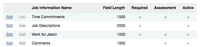
| Problem | The user needs to be able to rearrange the order of rows in a particular data table. |
|---|---|
| Pattern | Up and down arrows facilitate the movement of a row, higher or lower in the table. |
| Result | This allows the user to have more granular control over how the data is displayed. |
Status Indicator

| Problem | The user needs to be see the status of a batch of requests that has been processed. |
|---|---|
| Pattern | The status of each unique request is shown, and is color coded by success or failure. |
| Result | This allows users to easily scan the page for requests that need special attention. |